Designing a Modern Apothecary
發表: September 25, 2017
類別: life+style.

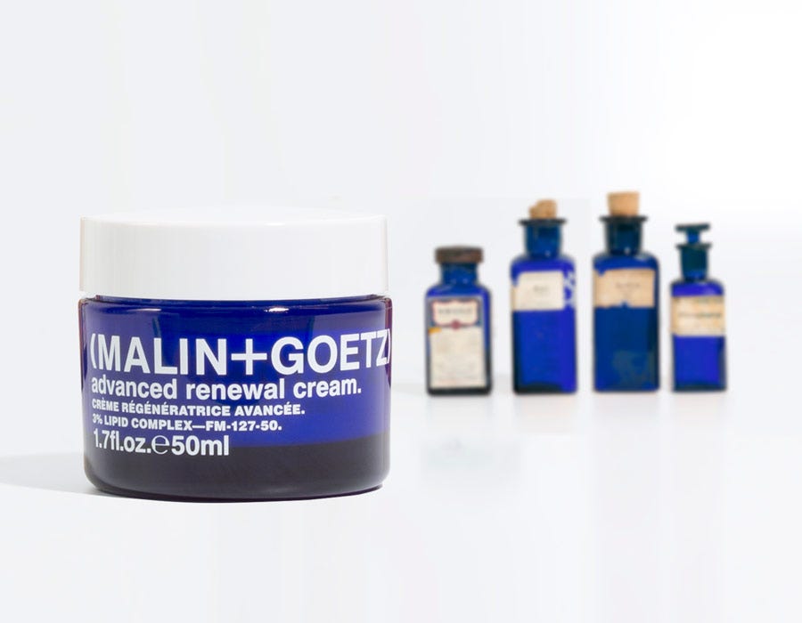
When it came time to design the newest addition to our anti-aging line, we looked back on the original inspiration for our packaging: vintage apothecary jars.
Our office houses a curated library of various shapes and sizes, with labels in different stages of deterioration, mostly from the 1940’-50’s holding everything from benzine to talcum powder. The cobalt blue has been something that has struck our eye, and we wanted to pull from that when it came time to find the perfect vessel.
This luxurious cream sits alongside our revitalizing eye cream and recovery treatment oil, and is the hero of the line. All three are primary bottle/jars are packaged in blue glass with white type.
The outer packaging plays homage to our original packaging from 13 years ago when the brand was created. Singular color (pms 285) denotes the entire text on the outer cartons. When we launched our first products, the packaging was all one color.
When merchandised, these 3 products live together in our stores and on-line, and create their own story amongst our assortment, based on looks alone. (Forget about their incredible performance.)
written by: M+G Design Team

